
WORKING WITH TABLES AND FRAMES
Go To Chapter 1


Learn HTML Online Practically for FREE | FREE Live Sessions
TABLE
Tables are used for structuring and displaying complex information in a structured format on a web page. Tables are used in web pages to enhance readability by presenting information in a structured way.

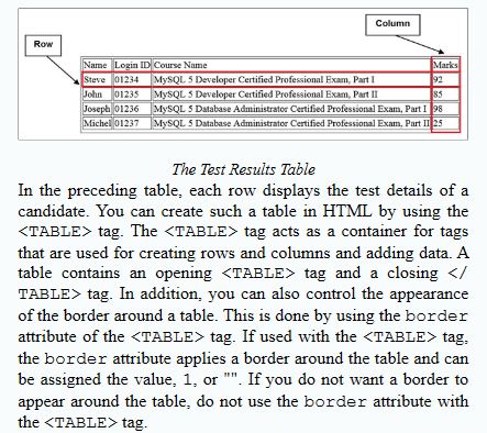
The table is divided into the following logical sections:-
- Body
- Header
- Footer
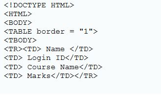
Specifying Table Body:-
The table body contains data arranged in rows. Each row further comprises one or multiple columns. The rows of the body of a table can be grouped by using the <TBody> Tag. You can use more than one <TBODY> tag inside the table.
Creating Rows:-
For adding rows to a table, the <TR> tag is used. The contents of a row are placed between the <tr> and </tr> container tags.
Creating Columns:-
For adding columns to a row, the <td> tag is used. The <td> tag specifies the content of the columns. The content is enclosed within the <td> and </td> container tags.

Combining Multiple rows and columns into a single cell colspan:-

Rowspan:-


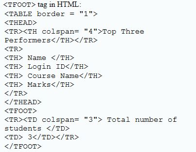
Creating Heading for the table column:-
To create the headings for the table column you can use the <th> tag. The <th> tag displays the heading in bold and is centrally aligned.


Specifying Table Footer:-
Specifying the Table Caption:-

Learn HTML Online Practically for FREE | FREE Live Sessions
Web Form
To create a Form on the web page you need to use <Form> Tag. The <Form> tag helps you define a form. It has an opening <Form> tag and closing </Form> tag.
The Form tag supports the following attributes:-
- Name
- ID
- Action
- Method
- Autocomplete
- Novalidate
- Target
Name:-
The name attribute is used to specify a unique name for a form. It is used to uniquely identify a form in the get and post methods at the time of form submission.
Id:-
The Id attribute is used to specify a unique Id for a form element on a web page. The Id attribute should be unique in the entire HTML document.
Action:-
The action attribute specifies the URL of the page to which the contents of the form are submitted. If this attribute is missing, the URL of the document itself is assumed as the location for the form submission.
Method:-
The method attribute is used to specify the format in which the data will be submitted to file or the URL specified in the action attribute.
It can take either of the following values:-
- Get
- Post
Get:-
The get value appends the form data to the URL of the form as the name-value pair at the time of form submission. Since the data is appended to the URL, it is always visible to the users. The size of data that can be submitted using the get method is limited to only 3000 characters.
Post:-
The post value does not append the form data to the URL of the form when it is submitted. Therefore the data is not shown in the URL and offers a secure way of submitting the data. Also, a large amount of data can be sent using the post method.
Autocomplete:-
The autocomplete attribute is used to specify whether a form should have the autocomplete feature on or off. If it is on, the browser automatically completes the values in the fields based on the values that the user has entered before.
Novalidate:-
The novalidate attribute specifies that the data in the form should not be validated by the browser at the time of data submission. It is an empty attribute that does not contain any value.
Target:-
The target attribute is used to specify the name of the frame or the window in which the response obtained after submitting the form needs to be displayed.
The target attribute can have one of the following values:-
_blank:-
Specifies that the response should be displayed in a new frame or window.
_self:-
Specifies that the response should be displayed in the same frame.
_parent:-
Specifies that the response should be displayed in the parent frame or window.
_top:-
Specifies that the response should be displayed in the full body of the window.
Frame_name:-
Specifies that the response should be displayed in the specified frame.
Exploring Form Elements:-
- <Input>
- <Select>
- <Label>
- <Fieldset>
- <Textarea>
- <Datalist>
- <Keygen>
- <Output>
- <Button>
<Input>:-
The <input> tag is used to create input fields inside a form. These fields are used to accept input from users. Input fields are of various types, such as textbox, radio button, or check box. The <input> tag has some important attributes such as type, value, name, ID, autocomplete, autofocus, form, required, pattern, a placeholder.
Defining the type attribute:-
The type attribute has the following values:-
Text:-
create a single-line editable text field. When the value of the type attribute is text, two additional attributes size and maxlength can also be specified.
<input type=”text” name”fname” size=”20” maxlength=”20”>
Password:-
Creates a password field, which will not display the characters being typed by the user.
Radio:-
Creates a radio button, which lets the user select one of the options from a set of given options.
When the value of the type attribute is radio, an additional attribute checked can also be specified. The checked attribute is used to specify that the radio button appears pre-selected when the page loads.
Checkbox:-
create a check box that lets the user select one or more options from a set of given options.
Submit:-
Creates a submit button, which submits the form data to the location specified in the action attribute of the form. When the value of type attribute is submitted some additional attributes, such as formaction, formmethod, formtarget and formnovalidate can also be specified.
Formaction:-
It is used to specify a URL where the form data would be submitted when the submit button is clicked. The URL specified in the formaction attribute of the submit button overrides the URL specified in the action attribute of the <Form> tag.
Formmethod:-
It is used to specify the method, such as get and post, using which the form data will be sent to the file or URL specified in the action attribute of the form. The value specified for the formmethod attribute of the submit button overrides the value of the method attribute of the <Form> tag.
Formtarget:-
It is used to specify the name of the frame or the window in which the response would be displayed when the form is submitted.
Formnovalidate:-
Every form is validated by default unless you use the novalidate attribute with the <Form> tag.
Reset:-
Creates a reset button, which clears the values entered by a user in the form field.
Adds a field that is used to enter the URL of a website. The value in this field is automatically validated for correctness when the form is submitted.
Email:-
Creates a field in an HTML form to accept the email address from the users.
Range:-
Creates a slider control to enter a numeric value within a range. The default range of the slider is 0 to 100. When the value of the type attribute is a range, additional attributes such as min, max, value, and step can also be specified. Min for minimum value, Max for maximum value, value attributes for current value within the range field.
<input type=”range” max=”50” min=”10” step=”5” value=”10”>
Date:-
Is used to define a date field in an HTML form. It allows a user to select a date.
Time:-
Is used to define a time field in an HTML form. It allows a user to select the time.
Number:-
Is used to create an input field for entering a numeric value.
Is used to accept a telephone number from the user.
Image:-
is used to specify an image to be used as a submit button. When the value of a type attribute as image, some additional attributes such as height, width, alt, and src can also be specified.
Height and width:- Specify the height and width for the image.
Alt:- use to display an alternative text if image not displayed.
Src:- Specify the URL or address of the image.
Some attributes list:-
- Value
- Name
- ID
- Autocomplete
- Autofocus
- Required
- Pattern
- Placeholder
<Select>:-
The select tag is a container tag. It creates a drop-down list on the form. It has the following
attributes:-
Multiple:- This is used to allow the user to select more than one value from the drop-down list by using the ctrl key.
Name:- This is used to specify the name of the selection list that will be used at the time of submitting the form.
Size:- Is used to specify the number of visible items in the drop-down list.
Autofocus:- This is used to ensure the focus is on the drop-down list when the page loads.
Form:- This is used to specify the name of one or more forms to which the <select> tag belongs.
Defining the <Option> tag:-
It is always used within the <select> tag and cannot be used as a standalone tag. It is used to create a list of options in the drop-down list and has the following attributes:-
Selected:- This is used to indicate that a particular option comes pre-selected when the page loads in the browser.
Value:- This is used to indicate the value of the option to be sent on the form submission when that option is selected by the user.
Disabled:- This is used to indicate that an option should be disabled when the page loads.
Defining <OPTGROUP> tag:-
The <OPTGROUP> tag is used to group the related options in one group. It is generally used when you have a long list of options and you want to group the related options in one to make it simpler.
Attributes:-
Disabled:- This is used to indicate that an option group should be shown disabled when the page loads.
Label:- This is used to specify a label for the option group.
<LABEL>:-
The <label> tag is used to define a table for the input fields. You can also define a label for the output tag.
Attributes:-
For:- Is used to bind the <label> tag with the input field and should have the same value as the ID attribute of the input field.
From:- This is used to specify the name of one or more forms to which the <label> tag belongs.
<FIELDSET>:-
The <FIELDSET> tag is used to combine and group related fields in a form. It creates a box around the selected field. You can also define the description for the fieldset by using the <Legend> tag. The <legend> tag is used to define the caption for the fieldset tag.
Attributes:-
Disabled:- The disabled attribute is used to indicate that a group of fields should be shown disabled when the page loads.
Form:- The form attribute is used to specify the name of one or more forms to which the <fieldset> tag belongs.
Name:- The name attribute is used to specify the name for the fieldset.
<TEXTAREA>:-
The <textarea> tag creates a field in which users can enter a large amount of text.
Attributes:-
Rows:-The rows attribute helps to set the number of rows of text that will be visible without scrolling up or down in the field.
Cols:- The cols attribute helps to set the number of columns of text that will be visible without scrolling right or left in the field.
<DATALIST>:-
The <DATALIST> tag is used to create a list of pre-defined options for an input field. It is used to provide an autocomplete feature on input fields so that the user can view the drop-down list of pre-defined options whenever they input data.
<KEYGEN>:-
The <KEYGEN> tag is used to specify a key pair generated field in a form. Whenever the form is submitted, the private and public keys are generated, where the private key is stored locally, and the public key is sent to the server. As a public key is stored in the server it can be used to authenticate a user in the future.
Attributes:-
Autofocus:- This is used to specify that the <KEYGEN> tag automatically gets the focus when a web page loads.
Disabled:- This is used to indicate that a <KEYGEN> tag should be shown disabled when the page loads.
Name:- Used to specify a name for the <KEYGEN> tag.
Keytype:- This is used to specify the security algorithm of the key. It accepts the name of the various security algorithms, such as rsa, dsa, andec as its value.
Form:- This is used to specify the name of one or more forms to which the <KEYGEN> tag belongs.
<OUTPUT>:-
The <OUTPUT> tag is used to represent the result of a calculation.
Attributes:-
For:- Is used to specify the relationship between the input fields used and the result generated for the calculation.
Form:- This is used to specify the name of one or more forms to which the <OUTPUT> tag belongs.
Name:- This is used to specify the name for the <OUTPUT> tag.
<Button>:-
The <Button> tag is used to create a button. However unlike, input type submit you can specify text or an image within the button by using the <p> or <img> tags.
Attributes:-
- Type:- values are the button, submit and reset.
- Name
- Form
- Autofocus
- Disabled
Comments
Post a Comment
Hey Guys, If you have any question then please comment below.
Please do not post any spam links.